Table of Contents
Introduction to Advanced CSS
In the ever-changing world of web development, knowing advanced CSS techniques has become critical. Advanced CSS extends beyond simple styling, providing a wealth of tools and approaches for developing visually appealing and highly flexible websites. CSS has progressed from simple styling principles to complicated layouts and intricate animations that improve user experience.
CSS was originally used for simple tasks like altering colors, fonts, and basic positioning. However, as the web has become more sophisticated, so has the demand for advanced style skills. Today, advanced CSS techniques allow developers to incorporate responsive design, which ensures that websites look and perform properly on a wide range of devices and screen sizes. Flexbox and CSS Grid have changed layout design, enabling for more dynamic and adaptable content layouts.
Moreover, the advent of CSS animations and transitions has opened up new possibilities for adding interactive and engaging elements to web pages. These tools allow for the creation of smooth animations and transitions that can enhance the user experience without the need for JavaScript. Mastering these techniques is crucial for any modern web developer who aims to create seamless, polished, and engaging websites.
Understanding and utilizing advanced CSS techniques also leads to more maintainable and scalable code. With the adoption of methodologies such as BEM (Block, Element, Modifier) and the use of pre-processors like SASS or LESS, developers can write cleaner, more organized code. This not only facilitates easier debugging and updates but also ensures better collaboration within development teams.
As we delve deeper into the world of advanced CSS, it becomes clear that these techniques are not just about aesthetics; they are fundamental to building efficient, user-friendly, and adaptive web applications. This blog post will explore various advanced CSS strategies, offering insights and practical examples to help you elevate your web development skills.
CSS Grid and Flexbox
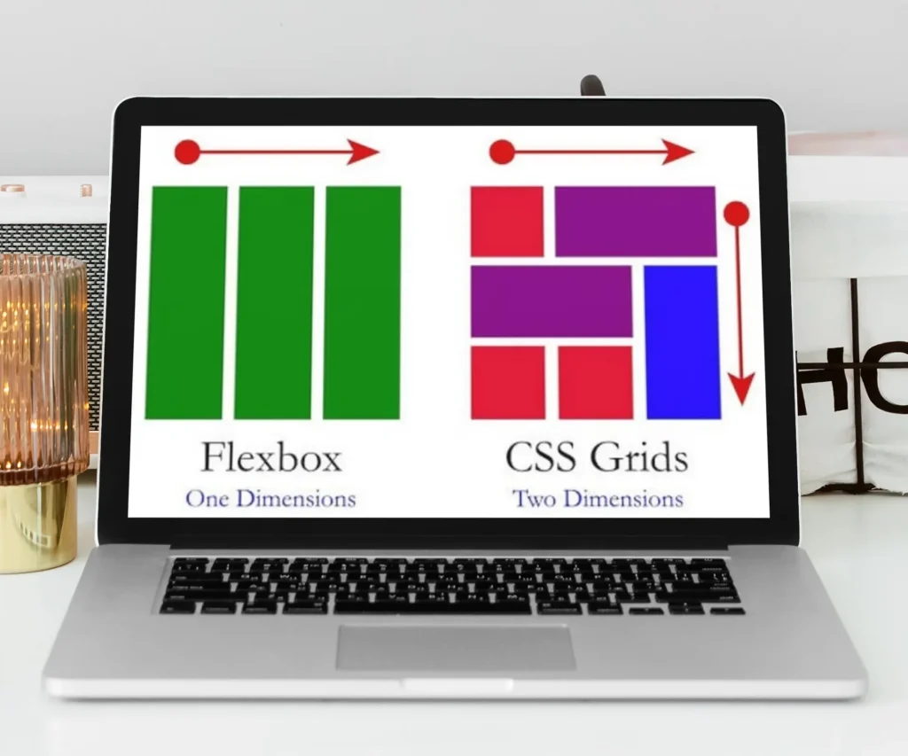
CSS Grid and Flexbox are two transformative layout systems in modern web development, providing designers with powerful tools to create responsive and complex web layouts. Both techniques offer unique advantages and use cases, making them essential skills for any front-end developer.
CSS Grid is a two-dimensional layout system that allows for the creation of flexible and efficient grid-based designs. It enables developers to define both rows and columns in a grid container, providing precise control over the placement of elements. This makes CSS Grid particularly suitable for creating complex layouts such as dashboards, image galleries, and main content areas with sidebars. A typical CSS Grid implementation involves defining a grid container and specifying the number of columns and rows using the grid-template-columns and grid-template-rows properties.
In contrast, Flexbox, or Flexible Box Layout, is a one-dimensional layout system that excels in distributing space within a container. It is ideal for aligning items in a row or column and is particularly effective for creating flexible layouts where items need to adjust their size or position dynamically. Flexbox properties such as justify-content, align-items, and flex-direction offer robust alignment and distribution capabilities, making it an excellent choice for navigation bars, form controls, and item lists.
While both CSS Grid and Flexbox have their strengths, understanding their use cases is crucial for optimal implementation. Use CSS Grid when you need to control both rows and columns simultaneously, and leverage Flexbox for simpler, one-dimensional layouts. Combining both techniques can also yield powerful results, such as using Flexbox for a header or footer within a CSS Grid layout.
Consider the following example illustrating the use of CSS Grid:
.container {display: grid;grid-template-columns: repeat(3, 1fr);grid-template-rows: auto;}.item {padding: 20px;border: 1px solid #ccc;}And a simple Flexbox example:
.flex-container {display: flex;justify-content: space-between;}.flex-item {flex: 1;padding: 10px;}Common pitfalls include overusing Flexbox for grid-like layouts or misapplying CSS Grid for simple alignment tasks. To ensure optimal use, follow best practices such as keeping your markup semantic, avoiding deeply nested grids, and utilizing browser developer tools to debug and refine your layouts.
Advanced Animations and Transitions
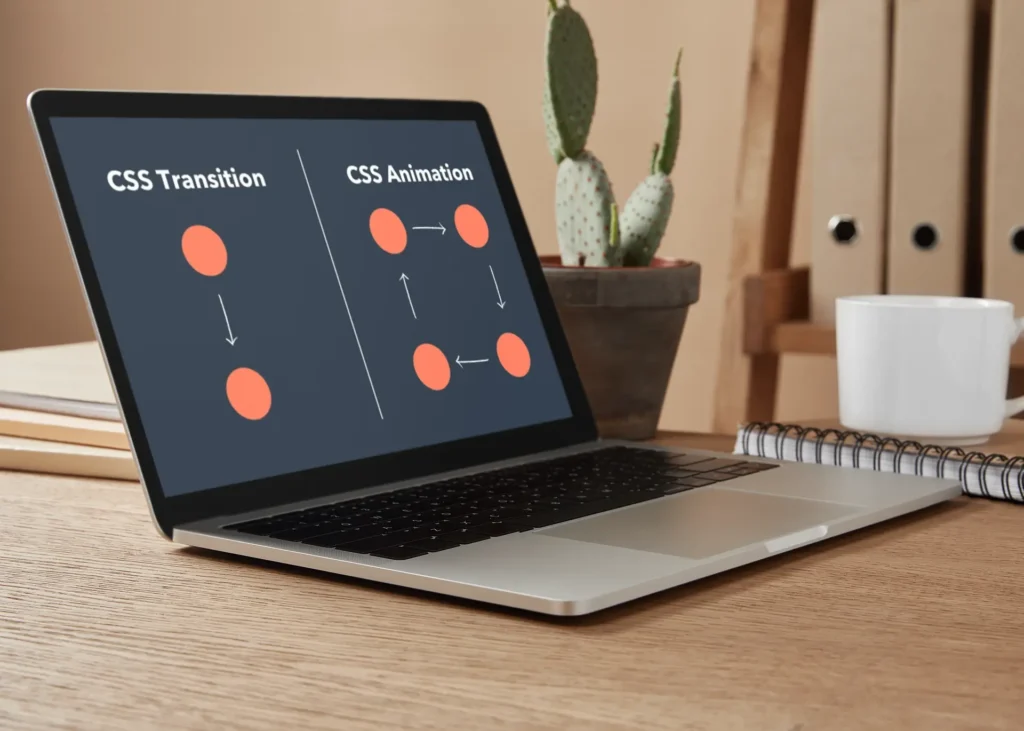
Creating sophisticated animations and transitions using CSS can significantly enhance user experience by making web interfaces more interactive and engaging. Key CSS properties such as transition, transform, animation, and @keyframes are essential tools for achieving this effect.
The transition property allows for smooth changes between state changes. For instance, a button can smoothly change its background color on hover by defining a transition like transition: background-color 0.3s ease;. Similarly, the transform property can be used to move, scale, rotate, or skew elements. Combining these two properties can create compelling effects, such as a card that flips on hover: transform: rotateY(180deg); with transition: transform 0.6s;.
For more complex animations, the @keyframes rule is indispensable. It allows you to define an animation sequence with multiple stages. For example, you can create a bouncing ball effect with:
@keyframes bounce {0%, 20%, 50%, 80%, 100% { transform: translateY(0); }40% { transform: translateY(-30px); }60% { transform: translateY(-15px); }}animation
animation: bounce 2s infinite;
For even more dynamic effects, CSS animations can be combined with JavaScript. This combination allows you to trigger animations in response to user interactions beyond simple hover states or page loads. JavaScript can dynamically add or remove CSS classes that contain animation properties, enabling more complex interaction patterns.
Optimizing animations for performance is crucial. Use hardware-accelerated properties such as transform and opacity to ensure smoother animations. Minimizing the number of animated elements and avoiding layout-thrashing properties like width and height can also improve performance.
Accessibility considerations should not be overlooked. Ensure that animations do not cause discomfort to users with motion sensitivity by respecting the prefers-reduced-motion media query:
@media (prefers-reduced-motion: reduce) {.your-animation-class {animation: none;}}CSS Variables and Custom Properties
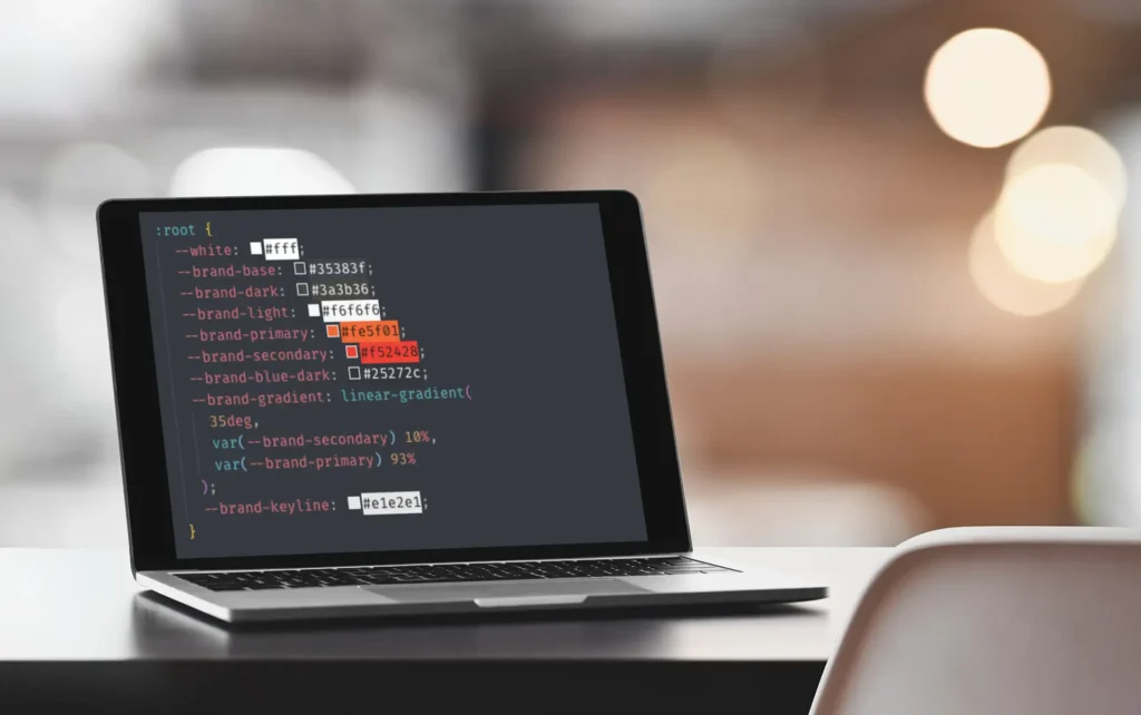
CSS variables, also known as custom properties, have revolutionized the way developers manage and manipulate stylesheets. With a simple syntax, CSS variables allow for more maintainable and scalable code. The basic syntax for declaring a CSS variable is straightforward: use the -- prefix followed by the variable name. For example, --main-color: #3498db; sets a custom property named --main-color with a value of #3498db. This variable can then be utilized throughout the stylesheet by referencing it with the var() function, such as color: var(--main-color);.
One of the notable advantages of using CSS variables is the ease of theming. By defining a set of variables for colors, typography, and spacing, you can create a consistent design system that is simple to update. For instance, changing the value of --main-color will automatically update all elements that use this variable, enabling efficient theme adjustments.
In addition to theming, CSS variables enhance maintainability. Instead of searching through numerous lines of code to make changes, developers can update the value of a single custom property. This reduces the risk of errors and ensures a more organized codebase. Furthermore, CSS variables support dynamic updates, allowing developers to change styles in response to user actions or other runtime conditions.
Advanced techniques with CSS variables include creating color schemes and responsive typography. For example, you can define a variable for a base font size and use it in calculations for other typographic properties. Changing the base size will proportionally adjust all related elements. Similarly, CSS variables can be employed in media queries to create responsive designs that adapt to various screen sizes.
Complex calculations are another area where CSS variables excel. By combining custom properties with the calc() function, developers can perform arithmetic operations directly within CSS. This is particularly useful for layouts that require precise spacing or fluid designs that adjust based on viewport dimensions.
To implement CSS variables effectively, follow best practices such as grouping related variables, using meaningful names, and leveraging fallback values to ensure compatibility with older browsers. Common use cases include theme toggles, modular component styling, and dynamically adjusting styles based on user preferences.
